Discover
The Problem
As the density of the online content increases, consumers are overloaded with choices.
The flood of social messaging apps can make it tough for families to feel connected, especially for multi-generational families or those that live far apart.
How might we create an integrated and user-friendly app that serves as a one-stop solution for all family-related needs?
Research
Interviews reveal pain-points and motivators
User-interviews were conducted with 5 unique individuals to gain insights on potential pain-points, user-needs, common-behaviors, preferences, expectations, etc.
After analyzing the results from the interviews, there were several common themes revealed;
"There are too many social apps to keep up with…"
"Posts from family get lost in the abundance of posts from other accounts…"
"… frustration with cluttered and complicated digital tools, emphasize the need for simplicity and user-friendliness."
Competitors don't quite meet user needs
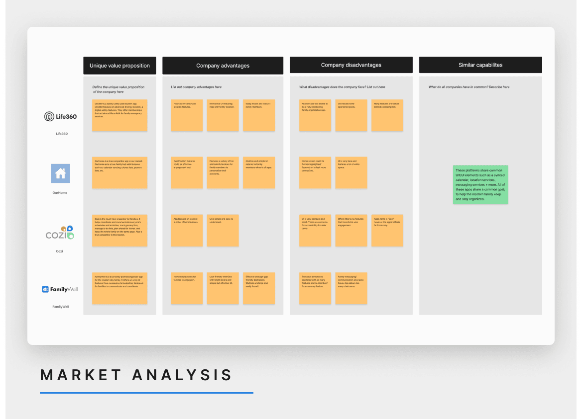
Platforms such as; Life360, Cozi and OurHome share common features such as a synced calendar, location services, messaging services + more. In terms of UI, the apps commonly use an assortment of colors effectively for a simple and inviting interface. All of these apps share a common goal; to help the modern family keep and stay productive and organized.
However, none of these apps meet the needs our target audience desires. These platforms quickly become just another app for family members to keep up with. They do little to help families feel more connected.
Key Insights
User-centric design is paramount, emphasize a user-friendly interface and intuitive features for all ages.
Cultivate a social experience with familiar features users can easily recognize and enjoy.
Adaptability is key to bridging generational communication gaps; accommodate both traditional and modern communication methods for users of all ages.
Ideate
Setting up the structure
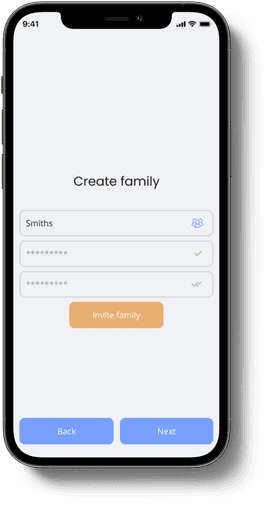
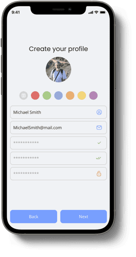
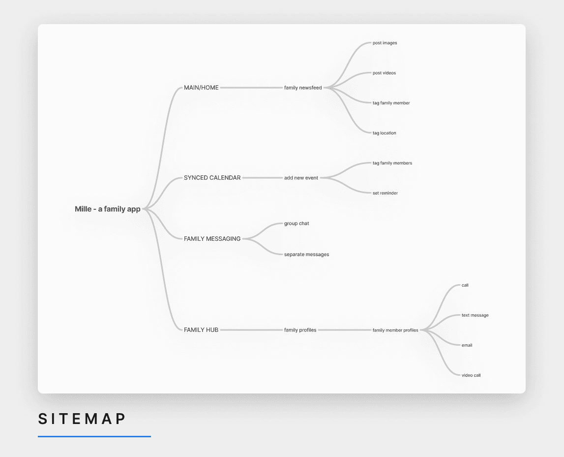
Keeping our target user in mind, I set up a sitemap that's clearly defined and intuitively organized for a painless onboarding process within the app.
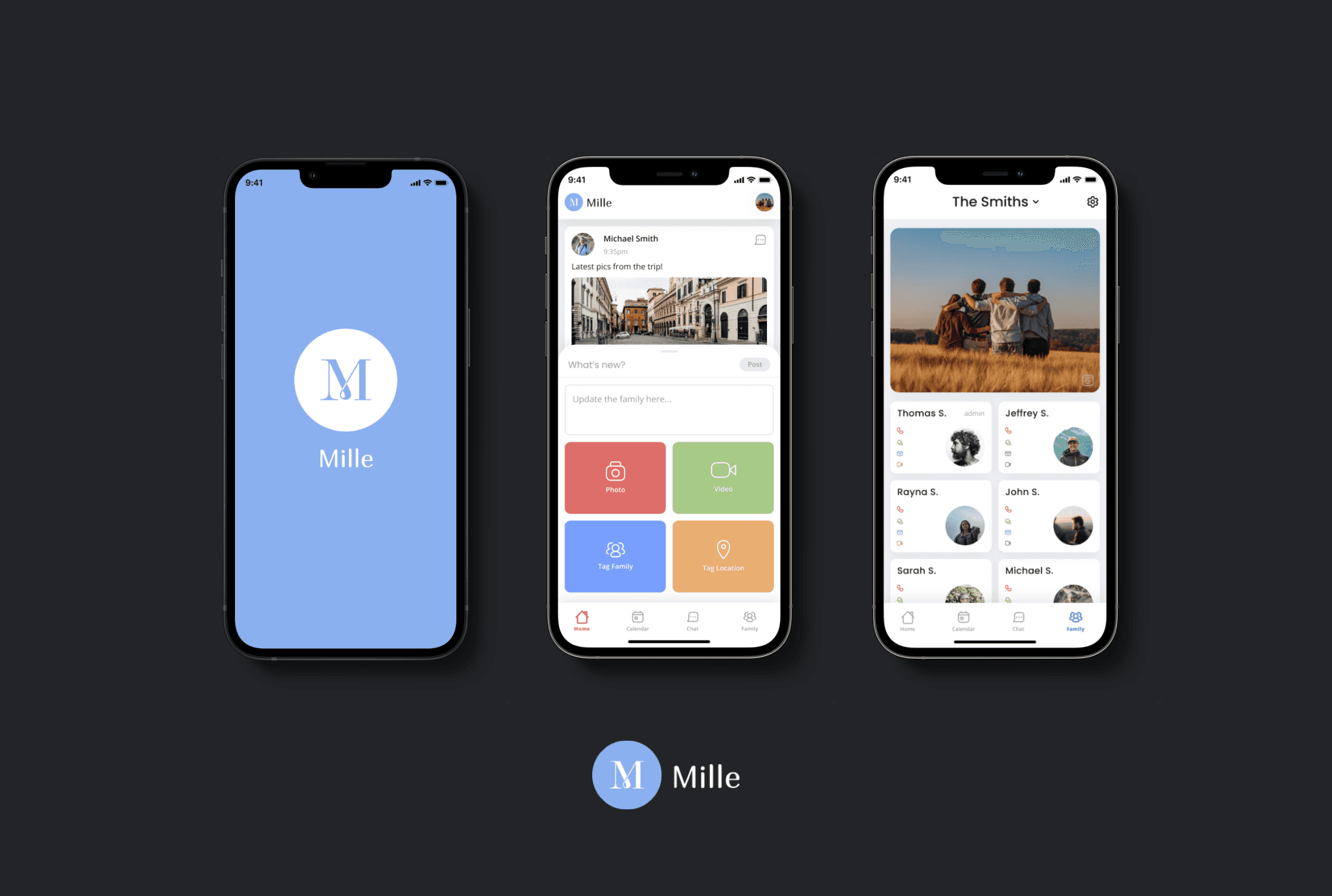
The UI is clutter-free, with just four main tabs in the navigation bar. All four tabs contain features that should be familiar enough for users to quickly get started on the app.
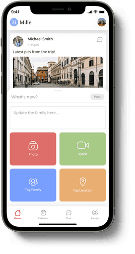
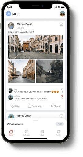
Home/Main - simply works as a social media feed, but exclusively with family members,
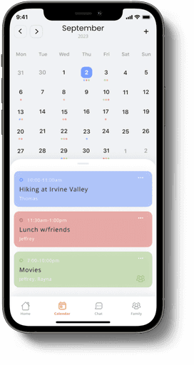
Calendar - looks and feels like most digital calendars, with a schedule synchronization feature for family members to keep up with one another,
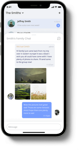
Messaging - functions like a group messaging app, but exclusively with family members,
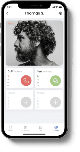
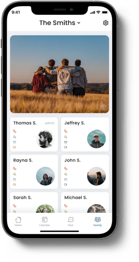
Family Hub - users can contact their family members via phone, messaging, email and video call under this tab.
Design
Crafting an identity
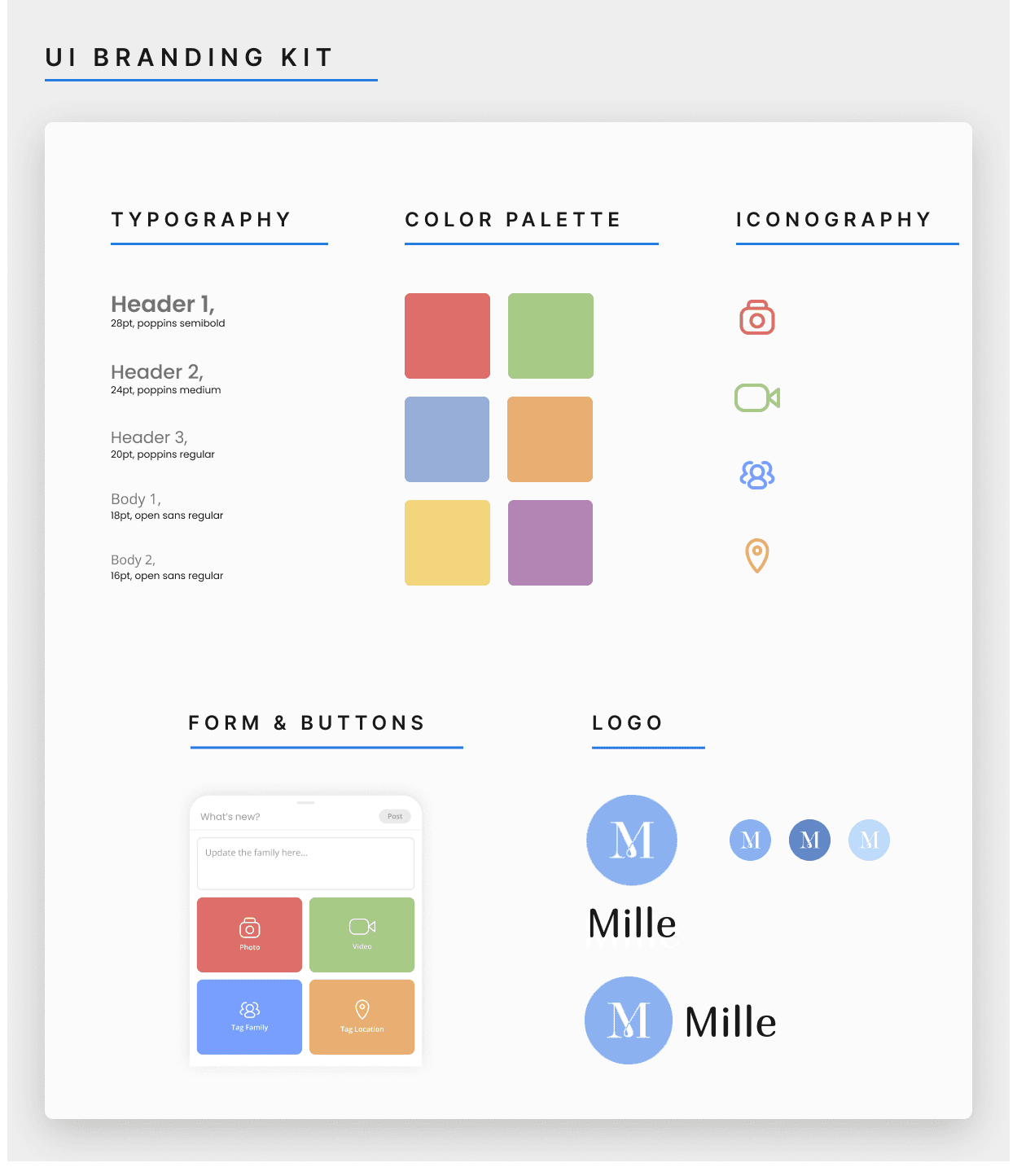
I created a UI design system that kept things consistent and clear. I picked easy-to-read fonts that work well in different sizes, and chose colors that are inviting and inclusive with good contrast. Plus, I implemented identifiable icons and familiar UI to make the app more enjoyable.
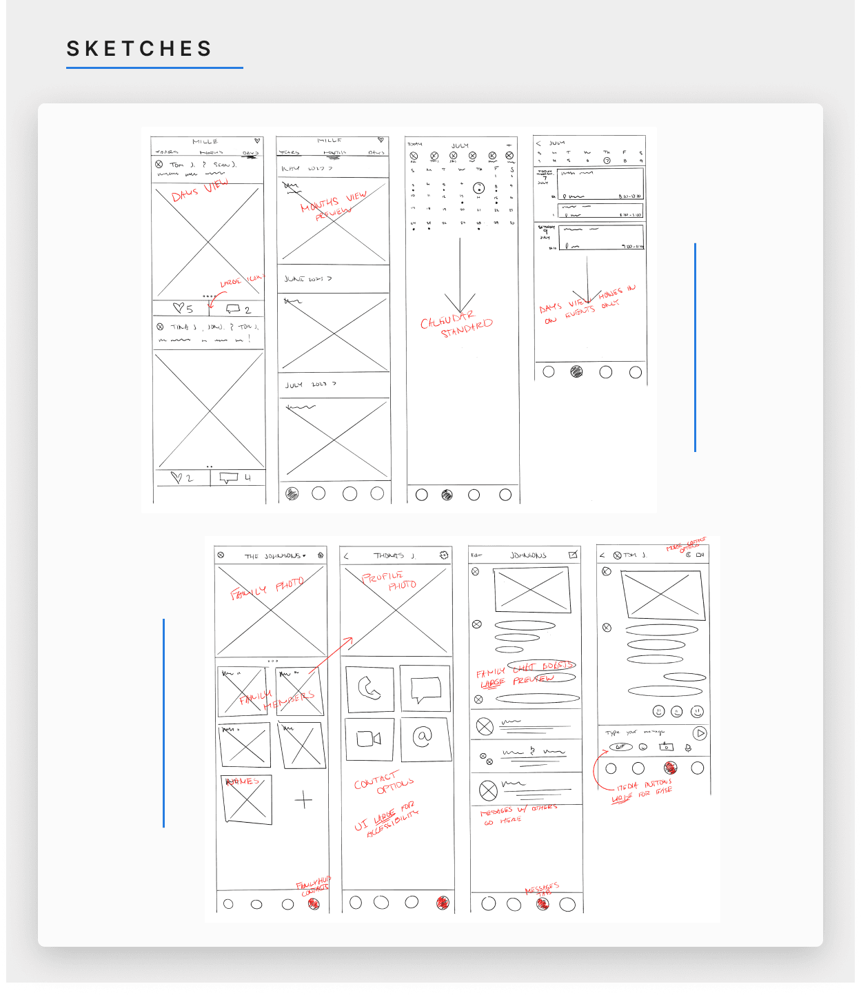
With the desired features in mind, I then sketched a several low-fidelity wireframes, putting together a useable skeleton for 'Mille'. Utilizing recognizable elements from popular apps, each tab was designed to look and feel familiar to users for quick and painless onboarding. There was no need for me to "reinvent the wheel" here.
Materializing ideas
After the high-fidelity wireframes were finalized, I designed the initial prototype of “Mille” for user testing, in order to identify design ideas that worked and that didn’t work.
User testing was conducted with 5 unique individuals. The results were then analyzed to determine what was successful, and what alterations need to be prioritized.
Final Design
Designed for family
key screens
Figma Prototype
A reflection…
What have you learned in the process?
Throughout this entire journey, I've come to realize that in the process of UX/UI development, not all designs need intricate details to be successful. Achieving the right balance between aesthetics and functionality is key.
What would you have done differently?
I’d like to have organized my creative ideas and designs more thoughtfully. Creating a cohesive “look and feel” requires more planning.
Next Steps?
Prototyping would be a good next step. Another great step to take would be to expand user testing to a larger audience.
What are you most proud of?
I’m most proud of creating for a dedicated user persona. With a persona in mind, designing became more thoughtful and meaningful.
